Thursday, 9 May 2019

Blue Zebra


2/5/2019 Last month saw us  taking the grandchildren to Twycross Zoo and I just loved the zebras.
Dusted off my box of acrylics for this one. Good start with the drawing, but gave up trying to draw the stripes - just a nightmare trying to work out what should be black and what should be white! In the end, I started painting the stripes directly from source. Haven't made up my mind about the background yet, want to keep it a bit surreal and colourful for a more contemporary look.


7/5/2019 I've learned to my sanity, painting a zebra with all those stripes is a major headache! Wish I'd have continued with drawing them, as it would have made the painting stage easier. Today's session saw all of the black stripes in place, and a lot of the whites. Thing is, it's not just black and white, and while there is always form to think about in painting, there is also anatomy with this painting - the way the stripes flow over the bones and muscles. I will need to re-iterate this more in subsequent layers


 9/5/2019 In the end, I decided on a very muted background so that the zebra remained the point of focus in the painting.

Sunday, 22 July 2018

Rip Up Your LP's!


Back in the early 1960's, like most other teenagers, I quickly developed an interest pop music played on the radio. I would listen to Radio Luxembourg which was one of the few radio stations that played non-stop pop music of the day, even though the signal would fade in and out significantly. One of the bands (we used to call them groups back then) that I really liked was The Beatles. I was a bit young for the very early stuff and came in on their second album With The Beatles. At that time, I’d just started a Saturday job in a grocery shop and saved up enough money to buy a record player and this set me off visiting record shops in the nearby town of Market Harborough. After buying a number of singles (first of which was Chris Montez’s Let’s Dance) I eventually bought my first LP, which was entitled With The Beatles. I thought then (and still do now) that this was the best band in the world! I played the album over and over, much to the annoyance of my parents! Some time later, I lent it to a friend, along with a couple of other albums, which he (unknown to me) lent them on to someone else. Needless to say, I never saw any of them again. A year or two back, the same album came out on CD in a cardboard sleeve, which I bought and now everything is right with my music world again!

My creativity here sees me recreating that album cover using ripped and cut magazine pages stuck onto board with PVA glue. It’s a technique I learned from Danielle Vaughn (of Sky Portrait Artist of the Year fame) but is only the second foray into this type of work. If any of you have looked at my website, you’ll have seen a Common Gull, which was my first attempt.

fig1.
 It was started in a workshop with a number of fellow artists, in which we had less than three hours, including setting up and clearing up afterwards. Whilst a number of our group roughly finished their work, mine was too intricate a task to complete in this time – see fig1. Another session at home saw significantly more added but nothing like a good likeness. The final session saw improvement in the faces but still not the best likeness, and here it will have to stop.

As our tutor mentioned, that with ripped paper work it’s easier to start with a large board than fiddle around with tiny slithers of paper – this I found to my peril, it’s nigh impossible to handle small pieces when there’s glue on them! For some very small pieces I resorted to using scissors and tweezers, with certain facial features built up separately, then glued to the main body of work ‘en masse’.

Second stage
Creating pictures using this medium is very addictive, and I guarantee that you will never look at a magazine again without see colours and patterns and thinking how gorgeous bits of this and that would look in a ripped paper picture!


Wednesday, 15 February 2017

For The Love Of Portraiture

This is my first post for 2017, and I've started the year working (mostly) on portraits. I seem to have an endless passion and fascination in painting people. Whether it's just a head, head and shoulders, full figure or even groups of people, it gives me such a buzz working it all out.
Like many artists, I never quite get everything right; OK, I think I'm improving, but there is so much to think about and so so much that can go wrong. From the contours of the face to the shape of the lips, the distance between the eyes and if the eyes are looking in the right direction, the placement of the nose etc, it all needs careful attention and observation.

Then there's the tonal qualities to think about and mixing the exact colour for all the different skin tones. All this has to be spot on in portraiture if we are going to get a good likeness.

With the oil painting of "Lina", I'd drawn it on the board and applied the acrylic ground (yellow ochre and burnt sienna mixed) in one evening. The following morning, I started to paint with oils and it was completed in 3-4 hours - sort of alla prima style. This was unusually fast for me. I'd been reading about how the Old Masters painted and the earthy colours that they used (often using pigments that they produced themselves) and tried to apply some of their techniques to this work with some success I think.

Friday, 4 November 2016

Over the Sea to the US


One of my portrait paintings has winged it's way over the Atlantic to be with its new owner.

This is the second portrait that I have done of Janna.

She tells me that she and her family love it - so nice to have your work appreciated.

Sunday, 30 October 2016

Painting the Show

Sheep Judging at the Leicester County Show - 400x300cm Oil on board
This year saw the revival of the Leicester County Show, which was held at Airfield Farm just to the North of Market Harborough. Having spent my earlier years in farming, I really love looking round agricultural shows and this one was a cracker!


Original photo: things were moved around or left out
in the finished work in order to aid composition.
Here I've painted a scene based on the sheep judging from my own photo, though I've moved things around to get a better composition.

Working on 6mm MDF, unusually for me, I didn't lay down a base colour over the board - just went straight in with my pencil. After spending some time on the sketch, the result looked quite complicated so I used a loose mixture of phthalo green and yellow ochre to pick out the areas of grass, which immediately made more sense of the scene.

Here the thinned phthalo green glaze clarified the work

Working my way around the figures and sheep, the painting started to take shape, but was slow going as I want add enough detail to make it look convincing, but not too much to make it look like a photograph. Fascinating work though.

Painting straight lines has always been a challenge for me, especially when they need to be thin! For this reason, the lines for the railings looked a bit wobbly, but does it really matter?


After adding the sky and distant parts, I worked my way
the figures one by one.
Sooner or later I knew that I would have to get around to painting the grass proper, but the thing is that painting every blade was going to take forever, so I used dry brush, wet brush, multiple colours on one brush and scratching out with a palette knife to get some variety and texture in the base green, though I don't quite know if I succeeded or not on that one.

Overall, this work took around one month to complete working around two sessions a week, mostly at painting groups that I attend regularly - somewhat longer than is usually the case.

Visit me on Twitter frankb1062   or visit my website

Sunday, 7 August 2016

Can I Make My Own Frames?

The high cost of getting work framed these days can push the price tag of our paintings quite high. While this may not be a problem for established artists who can command a good price for their work, it can be quite a problem for us lesser known amateurs.

The last work that I had professionally framed, though quite a small painting, cost me more than the overall value of the price tag that I could put on the work! I mean, don't get me wrong, my current framer makes a fantastic job of framing my artwork, but maybe I should look at doing some things differently?
I have on occasion bought second hand frames from car boot sales and re-painted them, with some success, though to be honest, most frames at a car boot can be in a pretty rough state, and getting one the right size, often difficult.


My other line of thinking was, could I make my own frames from scratch? Whilst I am pretty handy at woodwork, this could prove quite a challenge. In fact, it really did with my first efforts!

Fig1. Cross section of how I frame my oil paintings done on board
The kind of frames that I thought that I might be able to make myself, are the ones that house my oil paintings done on 6mm MDF board. Not sure what these type of frames are called, but they are made from simple lengths of timber with a rebate down one edge, where the board is inserted at the front.

 My first two attempts to cut a rebate from a length of timber failed miserably! First using a router, then using a hand rebating plane - nearly took my finger off with the router and couldn't keep a straight cut with the plane! The resultant length of timber went back in the garage and I thought that it was time to give up.
A couple of days later, I had a brainwave! What about the wood yard just down the road - surely they have the equipment to rebate a length of PAR timber? My thinking turned out to be good, as the young lad in charge of the woodworking equipment was only too happy to help, and in about five minutes, had done a perfect job for me with a 3.6m length of timber. The charge for this at the till was an amazing £4.00! Fig1. shows how the softwood was cut to accommodate the board.

Fig2. frame pieces cut ready for assembly.
My next task was to cut the timber to the correct lengths using a mitre saw. Fortunately, I have both a power and a precision hand mitring saw, though the power one didn't have a fine enough blade, so had to do this by hand. It took some practice to make a satisfactory cut at first, but a few lengths later I'd got it weighed up. See fig2.

With all the frame pieces cut, how on earth was I going to hold all this together? I could just glue the ends together, use some sort of clamps maybe, but how strong would that be? Time to look on t'internet I thought. After a while, it was Amazon to the rescue - within a couple of days, a super-dooper, all bells and whistles, picture framing kit landed in my front porch! What a fabulous piece of kit - within a few minutes, after making a test corner, I had the first frame made, with lovely wedges driven into the corners and glued for good measure.

The finished frames
The initial rebate proved to be slightly small, but a few days later, I had several lengths made with a modified rebate and framed some more paintings. These frames were given two coats of gesso by brush, followed by a good quality, white spray paint.
I have to say that the finished frames look super and easily good enough for exhibition purposes, so the answer to the question "Can I Make My Own Frames", is for this type of frame yes.


Tuesday, 12 July 2016

The Ewe in Oils


At the end of first stage
 I usually complete one painting about every 1 to 2 weeks, depending on the size of the support or type of medium used. If it's a request or commission, maybe a a little longer.  My latest work is this painting of a ewe in a barn with straw on the floor. Like a lot of my work, it's based on a photograph. In the original shot is also a lamb, who apart from looking a bit sorry for himself, is looking down and away from his mother so I decided to leave him out and go for a straight, profile view of the ewe.

The Ewe: Oil on board 30x30cm
 Unusually for me, I am using a black colour mixed with Purple Dioxazine for the background and darkest parts of the sheep. In the first picture, I've sketched the subject in pencil and used a background wash of yellow ochre mixed with burnt sienna thinned with white spirit and dried with the hair dryer. The background has been painted first - another anomaly with me, and the eye carefully completed in one go. This was the most colourful part of the work and very satisfying to do.
The first clumps of wool are now in place too, after weighing up the hue of the wool - the first assumption is that it would be generally white, but on closer inspection, there are many variations of tone and colour in the fleece.

The finished painting reflects my current style with oils; that is to try and make every brush stroke count - not going over any painted area again if possible. This in my view, helps to keep the painting looking fresh. When we start to push paint around, this is when the colours start to look muddy. The support I use now mostly, is 6mm MDF board, which is cheap, lovely to work on and shows up brush marks beautifully, also allowing me to give form to the image.

Thursday, 2 April 2015

New Paints


Self 2015 Oil on canvas paper 30x40 cm.

One year in the early 1970’s I attended an evening course learning how to paint in oils with local tutor Edna Bull. Being in my mid-twenties and a family man, I just did the one-off course where I produced several paintings, most of which (bar one) have long since disappeared. Since that time, I never looked at oils again, in fact until 2010 (except two years learning watercolour), didn’t do hardly any painting.

Nowadays, I’ve used quite a number of different media, but never oils until I watched Peter Barker do a demonstration with alkyd oils at the Oadby Society of Artists one evening. Although Peter has done some fabulous work (see his blog below), this particular seascape painting was quite simple, but he did show us the virtues of using this type of oil paint. Winsor & Newton Griffin Alkyd oils have a much faster drying time than conventional oils allowing the artist to paint over work done less than an hour earlier in the session. Another bonus is that these oils work out less expensive than the conventional type!

Spurred on by Peter’s demo, I bought the paints and started my first oil painting in 40 years! Not wanting to splash out too much on a media that I might not use again, I opted for just three primary colours (cadmium yellow light, cobalt blue, permanent rose) and Titanium white. It’s possible to get most colours that you would need from these.

After first session
After several months of using acrylic, these oils were a dream to use and blended beautifully (something hard to achieve with acrylics). My subject matter was the self-portrait shown here and the paint was touch dry soon after each session, allowing me to transport the work home from the painting club without fear of getting paint all over the car!

This painting took around ten days, and I did quite a detailed sketch in pencil first before laying on some of this lovely medium. It took me more time to do the shirt than it did my face! I think I am hooked on these paints now, and will probably stick with them, for the time being anyway.

Check-out Peter’s excellent blog here: http://peter-peterbarkerpaintings.blogspot.co.uk/

Tuesday, 24 February 2015

Le Nonne

Le Nonne
The main reason I paint these days is for my own personal pleasure and not what many people like or want to buy for that matter. Come to think of if it, I haven't sold a painting since last November! It is however, nice to be able to be relaxed when painting and not worry about meeting any deadline or pleasing anybody I guess.

Although I have several different styles going at the moment, I still occasionally try something a bit different, suddenly and spontaneously changing the way I work. Often it doesn't work or I get stuck or fail to portray what is going on in my head. But just occasionally something clicks and I think "oh, that actually works" or then I think that I've done something that is obviously different and not sure if it has worked or not.

The painting "Le Nonne" is one such work, something quite different for me. Friends that have seen it say they like it, but you are never quite sure about what they are saying because a lot of folk don't want to offend you and will say something is good when they may really feel otherwise. Any way, this work is based on a black-and-white photo my daughter took when on holiday in Italy last year. As I knew nothing about what the true colours of the scene were, I decided that rather than do a black-and-white work, I could get some earthy colours going - you know something like Rembrandt would go for. The resultant limited palette turned out something like sepia tone.

Just on the off chance, I thought that I would submit this painting a bit further afield than our small, local events. I've done this a few times over the last year or two, but always been rejected. Imagine my amazement then, when I got an email saying my submission has been accepted! So now, from March 14th - May 4th 2015, this work will be on show at the Leicester and East Midlands Open Art Exhibition 2015 to be held at the Newarke House Museum. Wow, what a result!

Friday, 1 August 2014

We Visit the National Portrait Gallery

People near Fountain. Pen & Wash 20x20 cm
Members of our art club were fortunate enough to have a coach trip down to London to visit the National Portrait gallery yesterday. The BP 2014 Portrait Exhibition was the star of the show and work exhibited was just incredible to see!

I later got the chance to sit in Trafalgar Square for a while and sketch some of the people sitting amongst the fountains just soaking up the sunshine or having a packed lunch and stuff. I was a bit nervous at first with so many people around me, but I soon got lost in my work, occasionally chatting to interested people, especially two American ladies who seemed delighted to look at this and former sketches in my book.

Lovely atmosphere, lovely time.

Thursday, 24 July 2014

Italian Cyclists

Italian Cyclists - acrylic 30x40 cms
Isn't it funny how you read all these articles in art magazines by competent artists who give you step-by-step instructions on how to create a masterpiece like theirs in several easy steps, then when you try it, it turns out to be utter rubbish that goes straight in the bin!

after 2 hours
Well for once, I followed one such artist's advice and tried a method of painting that was mostly alien to the normal way I do things, and I was actually quite surprised at the results. "Italian Cyclists" was definitely NOT the way I usually do things and scared the pants off me as it was mostly done at a painting club I belong to, and under much scrutiny from fellow artists.

Working from memory using a stretched canvas and acrylics, the first instruction I followed was to give the canvas an under-painting of red. Not sure what to do after that, I sketched the scene from a photo loosely with a small brush using burnt umber. Normally I would have meticulously sketched the scene in pencil first, though come to think of it, the last portrait I did was done initially in a similar way with a fine brush. The rest of the painting was done mainly using larger brushes, applying the paint in a fairly dry manner so that small areas of the under-painting showed through. I had much difficulty in stopping myself from going into more detail as I knew that I had to keep this one down to an impression.
after 4 hours

The painting took around three 2-hour sessions.

In conclusion, the resultant work that had a continuity about it and a feeling of a warm sunny day. This has set me off on a new course in the wonderful world of painting.

Monday, 24 February 2014

Great Bowden Village Boxing Day Meet

Great Bowden Boxing Day Meet
It is a tradition that goes back many years to hold the Fernie Hunt opening Meet on the village green in Great Bowden, Leicestershire. I try to attend this yearly event whenever I can, mainly to see my favourites, which are the hounds. This must be one of the few days in the year that the hounds are treated like pets with all the patting and stroking from the onlookers and especially the children and the animals just seem to lap up all the attention!

I've used acrylic paint on 16x20 inch stretched canvas for this one, which took two months from start to finish. The video below shows how the work came to fruition with each stage of the work.


Thursday, 30 January 2014

London Tourists - the finished painting


This has been the longest ever time that I've taken over a painting. It has also been on and off the shelf since its conception. I've been both tremendously excited and absolutely fed-up with it at times - a real roller-coaster of a work that well, I'm really glad but in a strange way sad that it's finished. All of the young people in this painting are strangers to me, but having painstakingly painted each of their faces, jackets and jumpers, crinkly jeans and assortment of footwear, I almost feel that I know each and every one of them in a strange way like a friend.

Thursday, 23 January 2014

Lino Printing - Simple, or is it?

Done Sledging

It's been almost a year since I posted anything on here despite so much that has happened in that time. 2013 has been a good year for me, sold a number of paintings and greetings cards, the proceeds of which have disappeared down that empty hole of investment in painting kit and material costs. That said, I am under no illusion of making it as a half decent artist, but those sales have given me confidence and a little support in the last chance attempt in making a go at a painting career in my twilight years!


My work in acrylics has been dominant in the last half of last year and I've been moving towards bigger and more detailed, though not necessarily better work! I'm always keen to try out new things, and this has resulted in a new medium for me - linocut prints. Did you used to do that at school? I know I did, must have been in junior school in the 1950's - crickey, that seems an awful long time ago!

The first two goes that I had at lino printing were abysmal. Chunky, stark looking images with little detail made me give up in disgust for a couple of months. Then I came across one or two linocut images on the internet which looked amazing. What was I doing wrong then? Like the proverbial poor workman who blames his tools, I put it down to cheap shoddy tools and incorrect ink. So I bought a selection of acrylic printing inks, synthetic lino and a set of better quality tools and with the help of a marvellous book that I put on my Christmas list (never expecting to actually get it), I set about the task with renewed enthusiasm.

The new kit worked!

I decided to go the whole hog and do a three colour 'reduction' or 'suicide' print - well if you are going to do something, might as well think big, or that's what I thought.


fig.2 second print run
For those who aren't familiar with reduction techniques, this means first cutting away anything that is white or the paper colour, then running off as many prints as you need in your underlying colour, then working through this technique for each subsequent colour, cutting away at the lino as you go, though in practice, it isn't quite as simple as that.

The picture above has sort of given me a crash course in lino cutting! For a start, the new lino that came turned out to be dark grey. This meant that after carefully drawing the image on paper, transferring it to the lino by tracing became impracticable - couldn't see my lines, and carbon paper didn't leave a mark on it. I ended up chalking the back of the paper, then tracing it that way, which was extremely messy but gave me enough of an image to use a white acrylic pen to draw over the fast smudging lines!

The next problem was that I didn't have a light enough blue for my needs, so ended up adding some normal titanium white acrylic paint to my blue ink and mixing it in - bad decision, as this altered the viscosity of the ink which was difficult to roll out smoothly and dried very quick, but I didn't want to wait another week for more ink to come through the post or the expense of it, so ploughed on.

fig.1 lino after 2nd cut
With six sheets of the first colour printed, I set about cutting away areas where I wanted the second colour. It's not easy trying to work it all out, but interesting non the less. When it came to printing the second colour with normal blue ink (fig2), the resultant image started to look much more like a picture, but at this point it became clear that the first paler blue was really a bit too dark; also in my eagerness I managed to cut away the boy's right glove ! Couldn't do anything about that now, on with cutting again to leave just the parts I wanted black. After this printing, the image was almost complete, just left the man's cuffs and sled to add by brush in yellow and red.

My first real foray into lino printing produced a few mistakes but was in the main enjoyable and really interesting. Registering the colours during each stage of the printing was no where near as hard as I thought it was going to be, thanks to the book. There are endless possibilities and techniques to explore for future works, so this is going to be an interesting little project between paintings. So a promising start to 2014 it is!

Sunday, 10 March 2013

A Change of Direction?

After the Storm Over Rape Field. 305 x 210 mm watercolour and pen.

A Change of Direction?
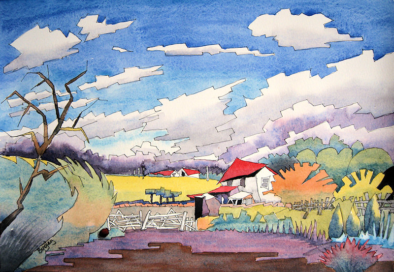
This is my first foray into cubism. I've never really liked Picasso’s cubism works or cubism in general, until I came across Barry Coombs. It is his watercolour works that inspired me to paint this landscape, which is something of a departure for me.


This painting may look familiar, as I've done this scene before as a normal watercolour (see picture below), but this time I wanted to keep it very simple and colourful and have tried to introduce some cubism element to the work. I think you’ll agree this version is a complete transformation.

I've used three primary colours (French ultramarine blue, cadmium red and cadmium yellow) with a little cerulean blue added, mixing large amounts of each and adding as much pigment as possible. Just seeing those three gorgeous colours in my palette dish in all their bright splendour was a real turn on and it felt so exciting to lay them down and drop them into each other on the paper!

I'm already hooked on this style of painting, and I think I may have to change the name of this blog from Frank’s Watercolour Revival to Frank’s Watercolour Discovery, as I seem to be finding out new ways of doing things all the time!
My original version
30 Tourists Part 2


Work on my current acrylic project is slow, and going to be a lot harder than I first thought. The faces are turning out to be more time consuming than I really wanted, and for some reason, skin tones are proving unusually difficult. Never mind, I will work it out!
This time I gave the whole canvas a light wash of  burnt sienna, taking care not to hide the pencil work too much and to stop those annoying white bits showing through my work. This also makes it easier when adding whitish highlights. The way I like to work is to treat each small area of the work one piece at a time, then move on, gradually building up to the finished painting. The layering that a lot of artists do, I'll leave for my watercolour work.
30 Tourists - Part 2. Acrylic on stretched canvas.