Wednesday 8 December 2010

Journal 6/12/2010 - Trip To Leicester

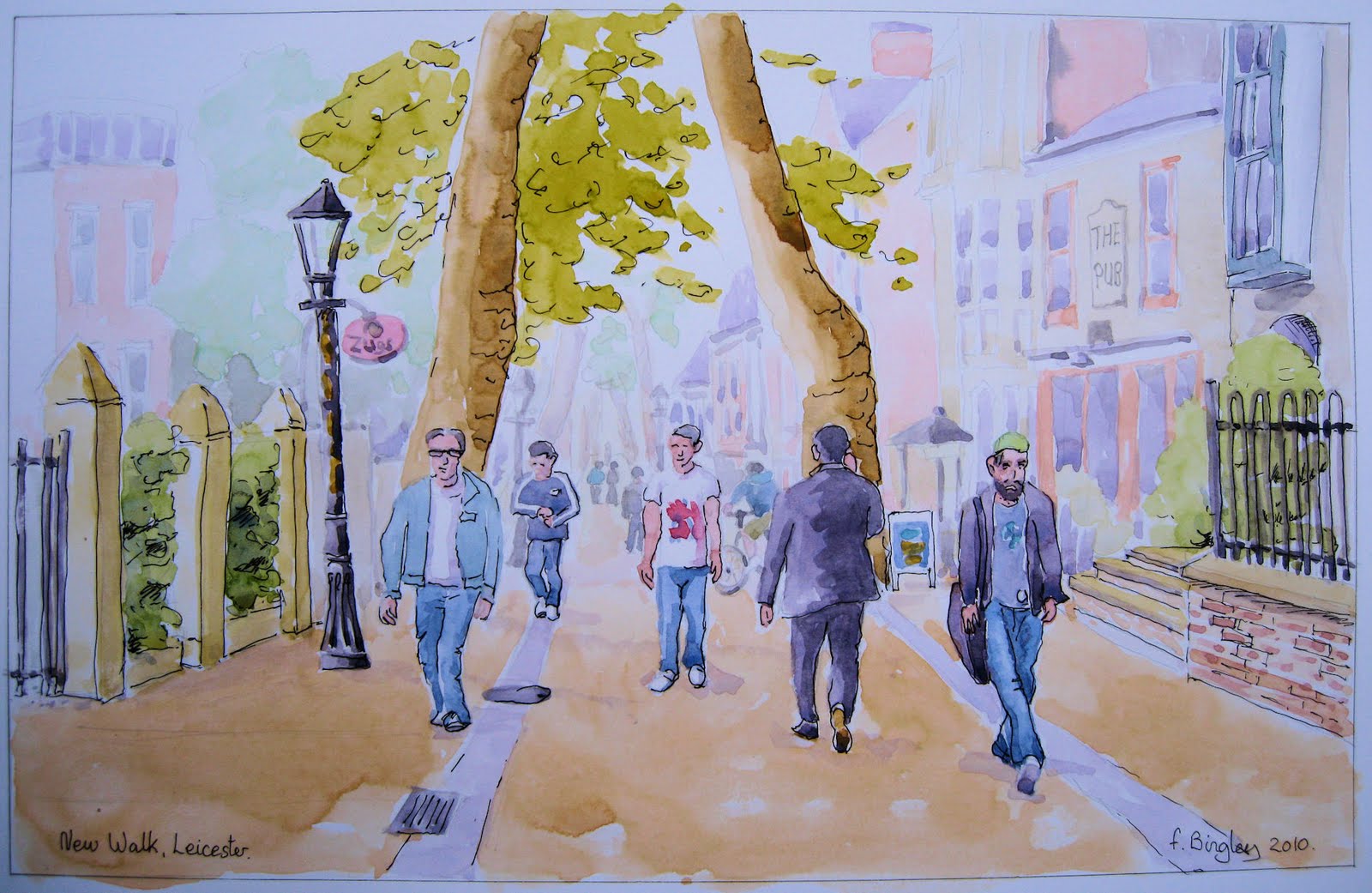
Taking the Arriva bus to Leicester

I guess none of us likes hospital appointments, but as mine was for 9:00am this morning, I decided that not having to go to work today, I would combine mine with a walk round the shops and market afterwards in Leicester, which is 16 miles away. To save the planet, petrol and the headache of morning rush hour in the city, and also the fact that I have a senior citizens bus pass, that I would take the bus.

Following a ten minute walk to the bus stop, and a five minute wait in freezing cold temperatures, the bus duly arrived and I took my seat, upstairs as this was a double-decker. It was so cold that the windows were frozen over, and that was on the inside! They never thawed out until we reached the outskirts of the city of Leicester over an hour later. The traffic was so bad that after I got off the bus, it only left me 12 minutes to walk the half mile or so down to the hospital to keep my appointment. It was quite a dash!

I won’t talk about the appointment, apart from the fact that two very large needles were stuck in me, while I watched it on the monitor at the same time. Ouch!


Around 10:30 I walked out of the hospital expecting the sun to have warmed things up a little, but nothing of the sort, as freezing fog set in and everywhere was getting whiter and whiter. To walk around Leicester market is a marvellous experience though, especially the fruit and veg section, where the most colourful displays, even in winter, of produce is piled high on the tables, with bowls of everything marked up at one pound a bowl, and the stall holders shouting out their wares, often in jovial fashion and very much in competition with their stallholder neighbours. You can fill your bag up with lots of fresh food for a few pounds.


The Seamstress outside The City Rooms Leicester

After buying only a few apples, I left to walk round some of the shopping malls, but this isn’t really my cup-of-tea, so ended up looking round some of the side streets, taking in some of the architecture, which interests me greatly. I just had to take a picture of the City Rooms and the statue of a seamstress outside, which although I’ve seen many times before, is gorgeous and I love to touch the bronze (I think) form, so smooth and cold in my hand.


The weather got really strange at that point, as although the sun began to shine, there was a strange showering of ice crystals swirling about glistening in the brightness of it all, and still very cold.


By afternoon I had had enough and it was time to catch the bus back home. The ride back was much less stressful, and with the rapidly clearing fog, produced the most amazing sight out of the bus window. The freezing fog had covered everything – trees, fields, even sheep with a thick frosty coating that was now gloriously sparkling in the sunshine, all against the deepest blue sky.


After a half mile walk back home, I sat down with a lovely cup of real coffee and reflected on the day. Then looking at my little pedometer that I attached to myself earlier that morning, I saw it read 9,894 steps! This translates to 5.62 miles – wow! But then looking at the next setting, guess how many calories I had burned? Well, would you believe it, just 400! I reckon that I ate more than that for breakfast, and now I was about to tuck into a couple of crumpets, chocolate biscuit, oh, and one of those lovely apples I bought earlier!

To see the City Rooms in 'streetview', click here:
http://maps.google.co.uk/maps?oe=UTF-8&ie=UTF8&q=city+rooms+leicester&fb=1&gl=uk&hq=city+rooms&hnear=Leicester&cid=0,0,13276293075708664441&ei=eFb_TPKeFsKYhQfQ-NC6Cw&oi=local_result&ved=0CCsQnwIwAQ&ll=52.633441,-1.134188&spn=0,0.018497&z=16&layer=c&cbll=52.633822,-1.134525&panoid=VcGX5DzrIEp3sncJlmP-bg&cbp=12,109.13,,0,-8.57

Sunday 28 November 2010

After the Storm (unfinished)

Drybrook
Watercolour A3
I was fortunate to get a week’s holiday in mid-September this year, and we spent a few pleasant days away in my son’s mobile home. The weather was good to us while we stayed at a campsite in Drybrook, Gloustershire, where we were able to explore some of the beautiful countryside further inland around the river Severn.


The views all around the site were pleasant, but one late afternoon there was a short shower followed by clearing blue skies. As the dark rain clouds receded into the distant landscape, the sun lit-up the fields in the foreground, adding the most breath-taking and colourful effect on the view before us. I immediately snapped this picture up for later reference, when it may or may not turn out to be a good subject for a painting.

The picture here is the (unfinished) result that I worked on at a couple of night school sessions. I say “unfinished”, because it still needs some more detail work on some of the foreground. However, I am unlikely to finish it because I spoilt what was a good sky by darkening the blue too much at the second session. Don’t tell me that I can lighten it, because my attention span has been surpassed, and I feel that the work as a whole is never going to turn out to be a good painting. I am simply including it here as a sort of ‘also ran’.

The things I like, and think I did get right are the foreground house and buildings, along with the gates and stone wall, and maybe some of the fencing on the right.

Ladies and gentlemen, I invite you to pull this work to pieces and tell me what you think works and what is not so good. Will I ever make a landscape artist or should I concentrate more on buildings, or maybe stick to portraiture? My future work is in your hands!

Sunday 21 November 2010

Journal 14/11/2010 Visit the Grandchildren


One of the best things about a family get together for me is meal times. I mean a proper meal where everyone sits at the table together and we chat, laugh sing or whatever as well as eat! No one is sitting with a plate in front of the TV, nor computer nor upstairs in their room; just enjoying family moments together over a nice meal.

This was the scenario last Sunday when we visited our two grandchildren, and after we’d played ourselves out with all the toys and books and things beforehand. We sat down to a lovely roast chicken with baked vegetables and gravy. Of course, we had the usual things with kids like getting excited and standing on the chair or trying to get them to eat what we think they should eat and not actually what the child wants to eat, but that is all part of bringing up a family.

Now the fun part for me was when it came to dessert. We had a little bowl of chocolates each (well mostly Maltesers), and a selection of fruit. I decided to have a little fun with William and made out I was going to pinch his bowl of Maltesers. Knowing full well my intentions, he pulled the dish well away from me chuckling “No, No” and “mine!” with a cheeky little smile and glint in his eye, and me trying to keep a straight face! So then I turned my attentions to Thomas, but he too pulled his dish away and pushed my hand back saying “These are not yours granddad, you’ve got your own!” while giggling at the same time.

Now a short time later, Thomas had to be excused to visit the loo, and while he was gone, I stole his dish and placed it right next to mine. On his return, he looked at the blank space and said “Where are my chocolates?”, and then with much exclamation, “Granddad!” which very definitely meant that I had to give them back followed by much laughter between us.

By the end of dinner, and some more playing, granddad began to get quite tired and ended up sitting slouched on the settee. Thomas seeing me like this, also decided that a rest was in order and he snuggled up under my arm and there we both were, stretched out on the settee, the best of playmates.

In that moment, Daddy popped round the corner, camera in hand, instructing us to say “cheese”. So, with a big long “cheeeeeeeeeese”, there was a flash, and another beautiful moment was captured for the family album. A moment which at some future point in time will be looked back on by some with fondness, maybe stumbled upon in a time of nostalgia with a feeling of love for those in the picture and, eventually, no longer with them.

Monday 15 November 2010

Journal 15/11/2010

Some of you have done some lovely picture journals, which have inspired me to have a go. Here is my first attempt, though not my intended first entry, that may come later - just to confuse things! :)


I hope I've done this right!

Wednesday 10 November 2010

Look no pencil!


At art class this week, our tutor gave us the task of painting a still life. Pretty straight forward, or so we all thought, untill we discovered that we were not allowed to use pencil to get an accurate image down on paper first, and the only medium allowed was watercolour. In addition, we were only allowed to use was a no.6 brush and in one colour only. There was also the fact that we had to paint it twice in our two hour lesson.


Well of course, this presented more of a challenge. In our tutor's words, these were to be "working drawings", where all our mistakes could not be erased and to be seen there in the finished artwork. There were a few gasps, but nevertheless, we set to using our paintbrushes in pencil fashion at first, then adding shading later.

In the first painting, I chose cobalt blue and quickly outlined the pots very roughly, correcting with shading as I went along. It seemed quite alien to paint this way, but turned out to be a highly intuative way to get the image down on paper. Apart from the initial linework, the shading was key to getting form and shape to the pots.

In the second painting, I used burnt umber and decided on a different tactic rather than do more of the same. This time I did no initial lines at all. I started with the handle of the tall vase and painted the shapes of the shadows. Then working my way round all the other pots in the same way - no outline, just shapes and depth of shadows. The highlight on the upturned bowl on the right was made visible by adding a lightly shaded background to make the white shape stand out. For me, this was a marvelous way to paint this still life, not by painting lines but merely painting shapes to form the picture.

The paper used for the first painting was heavy watercolour paper, but as I only had one sheet with me left, the brown version was done on ordinary cartridge paper, which had a lovely smooth finish, but buckled terribly, and of course the scanner recorded this as dark patches. The original is also more colourful than shown here.


I have to stress that these are quite rough sketches intended as practice for doing the 'real thing', but they are so useful for seeing what works well and to include in the final version etc. For instance the upturned bowl on the right of the second work looks really good when used with the negative shape created by the background.

In all, this has turned out to be a highly informative lesson and I am so glad that our tutor has took a firmer stand in giving us these projects, which teaches us not to get stuck in a rut with one style of painting doing our own projects in the same way each week.

Wednesday 3 November 2010

An open letter to all of You.

My dear fellow artists,
as many of you know, I started this blog earlier in the year to reflect my return to watercolour painting after a long break of 12 years. In the short space of time blogging away here, I think I have caught up with the standard I reached before putting my paint brushes down so long ago. While I have painted and painted, a lot of the techniques I had previously mastered, slowly came back to me, along with some new ones. I know I am not yet a good artist, but I know I can improve if time and fate are kind to me.


Thank you all for sharing your blogs with me, I have learnt so much by looking at your own work and reading your written thoughts no matter what your expertise in this lovely hobby. Blogging away like we do, we all help each other and I think advance our work en mass to a higher level. Thank you so much for all your comments, which have spurred me on to try to achieve a better and better standard of work.


The purpose of this blog was to take anyone interested along with me in my endeavour to pick up watercolour painting again and advance it to my former state. That being the case, I am now starting to add to my interest, other forms of artwork and media. You may of noticed the odd sketch and acrylic creep into these blogs. Now I introduce pastel, or to be precise, conté crayons to my growing list of medium.


With this in mind, I have decided to change the name of this blog slightly to reflect this additional content to "Frank's Watercolour and Art Revival". The link will remain the same so as not to lose all the work so far.


Thank you all once again, for reading, commenting and helping me in this artistic crusade!
My kindest regards,
Frank Bingley.


Martin
Conté Crayon, Charcoal and chalk
on 160gsm pastel paper.
MARTIN.

Since my last blog, I have joined my local art club, which meets once a month for ten months of the year. On my first attendance, we had a speaker who showed us his technique of charcoal artwork. His use of charcoal and a little pastel and chalk amazed us as he did superb portraits of two of us in less than a couple of hours. Spurred on by his work, I have purchased some similar media and had a go myself, and I have to say that it is  a fantastic and quick medium to work with. This sketch took me 70 minuets, and while considerably smaller than the speaker's, is 12x8 inches in size.

Though I got Martin's head slightly too tall, I think it is a reasonable likeness, and I got such a buzz out of doing it. Yes, this new addition to my mediums is a hit with me, and I can't wait to do some more!

Source photo here:
http://www.flickr.com/photos/oxfordshire_church_photos/3145141060/

Tuesday 26 October 2010

Acrylic Break

Kate
Acrylic on textured canvas paper
6.5"x10"
For me, watercolour is the most exciting medium for expressing my artistic leanings. But like anything else in life, too much of any one thing is not good for us. In any case, a break is as good as a rest, so they say, and a break in my way of thinking is to do something like pick up a pencil and just sketch or, as in this case, get out those under used acrylic paints and having another go at something that didn't go too well the last time I tried it.


So with brushes in hand and a newly acquired pot of  'flow improver', I set about another portrait. The one thing I did learn from last time is that, unlike watercolour, an acrylic painting is not improved by leaving (either on purpose or accidentally) small pieces of white paper showing through the painting. This in mind, after the initial pencil sketch, I went over the whole canvas with a diluted wash of burnt umber before adding any other paint. Also, unlike watercolour, I've found it's best to paint darker areas first, working towards lighter areas last. This also seems true with regard to detail, just blocking in main areas of colour first, then working finer and finer in detail.


The main sanity saver with acrylics though is the fact that any wrong brushwork can be easily overpainted to correct it, whereas with watercolour you are more or less stuck with it. But the one big drawback with this medium is the fact that, even with flow improver, the paint will set rapidly, especially on the palette. This can be a headache when you want more of the same colour you mixed earlier, only to find it set hard and re-mixing another lot to the same hue can be almost impossible. I now take very great care in remembering what colours I mix together for a particular tone.


The finished painting I think is not bad but took really quite  lot of work - this not helped by the stripy garment Kate is wearing here. The trouble is that I am still learning quite a lot as I go along and have to redo things like her face for example; painted twice once I realised a better way to do it, which adds unnecessary time. Most of you know that I have to finish a painting fairly quickly so as not to get bored and shove it to the back of the wardrobe! Again I got fair hair far too yellow and chunky for my liking - what is it with me painting hair, it's like I get a mental block or something at the end when I do the hair - can't do it at the beginning as I need to flick it out over the background and suchlike.


Still, the learning curve for me with acrylics is steep but leveling. Don't know if I ever will master this medium though, especially when I think of how much quicker and easily I could have done this painting with my favourite medium, watercolour.

Tuesday 19 October 2010

Southwold #2 The lighthouse.

Southwold Lighthouse
watercolour on 350gsm 140lb paper
In this painting I continue the view of Southwold  - two paintings from one photograph, that's a first for me. If you look at the photograph below, you can see that this scene is contained in the vertical red rectangle. The stone house on right here is the edge of the stone house on the left in painting one (see previous blog). These unfortunately, are not a pair as the viewpoint in the first painting is much closer. The girl on right is the same girl as in the first painting, but I moved her further into the scene to aid composition,


Originally I started this painting at art class, but only managed to do the drawing and first washes in the sky and the lighthouse. The first blue sky wash turned out to be too pale, so (horror of horrors) I had to add another blue wash, which gave me great difficulty in blending in with existing clouds, but I think I managed to pull it off fairly seamlessly. Another thing that I have found difficulty with are window panes. In the past I would just do grey or dark washes, but when you study them, with windows you can often see curtains and nets behind them. In others you can see reflections - especially of the sky. Here I think I have gone some way to make them look like they have curtains, but the scale is too small for reflections.
Two paintings from one photo
I have never painted cars before either so this is another first. The lady on the right appears in the first painting, but here she is facing the right way this time, where last time I had to turn her round. The lighthouse required much more shading than I first thought, even though it is white. I had to go really dark to make it stand out against the cloudy sky.


I have learnt so much in this work about washes, shading, perspective, windows and now cars. But that doesn't mean that I am going to get it right next time though! I know it isn't perfect - the scale goes a little wrong in one place and my overall work needs a little more saturation with colour and I also need to work more on my figure work, but this is I feel (though typical of my style of painting) is up to a new level for me. But having said this, I know the next painting could knock me right back down again. Such is the life of an aspiring artist!


Sunday 10 October 2010

Make hay While The Sun Shines!

Still Life
watercolour on 140lb not paper
It seems to me that I have forgotten a lot of what I learnt about watercolour painting more than a decade ago when I painted this still life in art class. Studying my work here, it appears that I am re-learning techniques that I had already mastered back then, like dry brushwork (in the background here), and reflective colour (the red of the onions and brown pot in the brass kettle). The way I have captured the brassy look of the kettle and the dull shine of the pewter shaker, I'm sure that I would be hard pressed to replicate this so well now. The layering used in painting the onions is identical to the method I learned in class last week (see last blog).


I now realise that I have a lot of catching up to do and it's quite clear that the ten years or so that I put my brushes away, was one of the worst decisions of my entire life. Those years are what I now refer to as the "Dark decade" Being in the Autumn years of my life, by the time I have got back to this standard, I'm sure I will be about ready to pop off this planet! If I had continued to paint through those years, surely I would be showing and selling my work by now?


So there's a message to all you budding artists out there: never take a break, never give up and make hay while the sun shines. Now where's that sketch pad ...


Saturday 9 October 2010

Art class 2: Layering


fig 1: Crab Apples
Yes, art class has started again after Summer recess. Julia our tutor has taken control of us and decided that we should all paint the same subject. Hurrah for that, but notice would have been nice as most of us are halfway through projects, never-the-less, I am all in favour as this is how I feel teaching art should be. It gives us all practice in the basic principles before we branch out with our own techniques. Also, seeing how everyone else perceives and translates the same subject is so interesting.


Julia arrived with a large bag full of crab apple twigs (amusingly complete with ladybirds which got taken away (I would have preferred to include these in the painting, but I guess it would have complicated things.)) Our task this time was to paint one twig each using the layering technique, being guided by our tutor at each stage.
Our first instruction was to very lightly and quickly draw the twigs, missing out (or erasing) the lightest lines. Next we had to make the lines in shadow a little bolder.


Now we came to painting and were instructed to pick out the lightest shade of the apples, mix the colour and apply a very light wash over all the apples. This apparently is called the "T wash". Then we applied the same technique to the leaves - the very palest green over them all, followed in the same way with the stalk. During the work, we were instructed to keep a colour chart, including the shades we didn't use (some of which I put a line though) - see diagram 2.
Next we applied the mid wash, which for my apples was the lightest red. Again we followed the same pattern with then leaves, but this time carefully leaving the t wash of the veins showing through. Eventually the darkest colours were added, then last of all some shading in the appropriate places.


A lot of us already knew something about this technique, but working this way was good practice and we all now have the basic fundamentals of layering.


fig 2: Palette
Summing up, in my mind this is a very good method for detailed or illustrative work producing neat, formal paintings. I would, however prefer to use it much more loosely, not worrying too much about keeping within the pencil lines, and I would definitely prefer adding a little wet-in-wet in places. A lot of people say they would wish to paint in a more loose style and I would agree with them up to a point though for me, I like to have some control over my washes at the same time.

Monday 4 October 2010

Back in the Groove

KIM
Watercolour on 300gsm paper.

Time taken: 2 hours.
It's been a while since I did any painting, what with holidaying in Gloucestershire, laying concrete, building a new shed - oh and having grandchildren over for a weekend, not to mention holding down a full time job walking the streets of Kibworth delivering milk!
Yesterday it poured with rain so those planned jobs to do outside got put on hold and I actually thought that I might have a nice restful Sunday. But oh no, it didn't quite work out that way. Getting ready to go out for our usual Sunday morning trip to Aldi, when I got the car out, it didn't feel right. In fact it had a puncture on the rear wheel. So having fished out the space saving wheel from the boot and hauling the trolley jack out of the garage, there I was bending over in the pouring rain trying to free the wheel nuts! Once this was achieved, you would think that all that remained would be to take off the wheel and replace with spare. Yes, that would be right only the wheel remained stuck on the axel, and no banging, hammering or levering from me was going to get it off!
So I put the wheel nuts back on and all my stuff away after deciding to try to inflate the tyre enough to get me down to our local Kwik Fit, but getting enough air in the tyre while it was gushing out past the nail which had punctured it was a lengthy business. Good job I have an little electric pump that connects to the auxiliary point in the car. Down at Kwik Fit, I was told that the puncture was too near the edge of the tyre and could not be repaired - oh and the other rear tyre was almost down to minimum tread depth. End result - a very wet and disgruntled Frank forked out £200 for two new tyres, oooooohhhhhhhhhhhhhh!!!


Anyway, the only thing all this has to do with the painting, is that while it rained, I did find time to do this portrait of Kim. I am actually quite pleased with this, well up to a point. I suppose none of us is ever really pleased with our efforts. The source photo was quite hazy and smaller than I've done her here, so more of a challenge than usual. Also the light on her face was almost full on, so I kept the facial tones pale. As usual I struggled a bit with the mouth, taking three goes to get it something like. In fact I ended up squaring up the small area around it. I still haven't mastered hair yet either, but I'm getting there. The background in the photo is of green bushes but I thought this would clash with her blue top and eye shadow, so I used a neutral colour here - in fact it's a mix of all the colours used in the painting with a little grey added. Kim is a very pretty lady and I hope I have done her justice with this one.


One thing I know though, is that I am back in the groove as far as painting goes, and it feels great!

Saturday 11 September 2010

Southwold

Watercolour on 140lb 300gsm knot paper


Southwold is a small seaside town on the east coast of England. It boasts a small harbour, plentitude of old cannons all facing seaward, an excellent pier and a lighthouse that is strangely set inland in the centre of the town. The photograph showing the lighthouse (taken with my back towards the cliffs) shows how far into the town it is situated.


This view I thought would make an interesting subject for a painting, but rather than the view of the lighthouse, I wanted to focus on the people that add so much interest to this shot. Eventually I narrowed the framing right down to the cluster of folk on the right. But this meant that the lady in a green top and black skirt was looking out of the picture - not good composition wise, so I mirrored her figure to face the right using Paint Shop Pro. Also, the boat mast in the centre rather cluttered up the scene so I used my artistic licence here and left it out.


Now the scene was set, I spent a couple of hours trying to get the drawing right, then another three sessions with the painting. Unusually for me, I painted the initial layer of all the figures first, and at the next paint stage added the form and shading. I'm pretty pleased with the way the couple on the right and lady on the left turned out, but goofed somewhat with the centre figures.
For the sky and chimneys I ventured for the first time in wet-on-wet technique and I have to say that this a lovely feeling how the colours mingled together here. I also got quite a buzz from adding the final details to the buildings with things like the window panes and shading. Seeing it all come together at the end is a marvelous feeling.


Suming up, I have mixed feelings about the work. There are certainly some mushy bits like the centre figures and other bits where I've surprised myself with things like the tall chimneys and young man on the right. This is also one of the few paintings I've done this large - full A3. So maybe I'll say its good, but 'could do better'.

Wednesday 25 August 2010

Pepepochi brings out the adventurous side of me.

Watercolour on 300gsm 140lb (9x12in)
Those that read this blog will know that I've mentioned before that I am totally addicted to Julia Kay's Portrait Party on Flickr.


In a previous post  (Done to Death)  I mentioned how I wish to improve my work and in this watercolour painting I have tried to bear in mind my words, i.e. loose washes, minimum layering, dropping in other colours while still wet, and to find a good balance between detail and impression.


I am fairly pleased with the work. Some of it's faults have been to the advantage of the finished work, like oversized eyes and watercolour not taking so well to parts of the paper where my hand has lain. A new technique I am trying is to add reflected colour as in the background here.


Isn't it lovely to have this medium at our disposal, to delve into and to explore it's capabilities. Watercolour is just so ..... amazing!

Friday 20 August 2010

Jordan - a sticky wicket!

Jordan. Acrylic on 240g textured canvass paper
(7x10 inches)

This is Jordan, who has been a friend of mine on MySpace and Facebook a number of years now. Like many young girls of her age, she often posts photos of herself but this is the first one I ever saw of her without braces on her teeth. I guess they've gone now and she can really smile with the best of us.


Jordan kindly agreed to let me do this painting and post it. I thought I would try acrylic this time, but I really got myself on to a sticky wicket with this one. Regular readers will know that I have only done one painting so far in acrylics, so I am really on unfamiliar territory with the medium. While acrylics give you more time than watercolour, they are quick drying and boy do they stick to the palette too! Before I could get down to more detail, the whole thing (and the paints) started to dry out on me, everything including the brushes got really sticky, so I eventually gave up on it, hastily adding a bit of background colour.


While this is a little rough for my liking, Jordan seemed very impressed with it. To be honest, I really need some tutoring with this medium or a lot, lot more practice. Anyway, here it is 'warts 'n all', ready for all to pull apart!

Monday 16 August 2010

The Slug and Lettuce, Leicester.


You know, life is so much more convenient these days. Back in the 60's and 70's, if we were out and about and saw something interesting that would make a good photograph, chances are that we would not have our camera with us. Even if we had, it would likely to be a large bulky affair, with which you would need to know how to adjust the settings for available light, focus and make sure you made allowances for the viewfinder being offset to the lens and of course have some film in it etc. So unless you were very lucky, you wouldn't get the shot.


Nowadays of course, you can walk around with a camera in your pocket and not even notice it was there. It can even be integrated with your mobile phone - something else that was uncontemplatable back then. What's more, these newfangled digital cameras will work out the exposure, set the focus, recognise faces and work out out so many things automatically and we come to take them as granted, unless of course you are one of us more seasoned of photographers!


Although I visit Leicester everyday in the course of my work, it is only very rarely that I actually walk around the place at my leisure. So when I did just that a few weeks ago, having a camera on my mobile came in very handy for taking a few pictures, which would come in useful as subjects for a piece of artwork at a later date.


This painting is one such piece of work. Originally, I planed to do just a quick sketch, but it turned out to be just a little bit more complex and detailed than I expected. I opted to use watercolour and pen on an A3 bristol board sheet as with the 'New Walk' painting. The colours are a little bit washy but this is only meant to be a sketch and I didn't want to overwork it. At the end I did need to use a little white gauche for the slug and lettuce motifs, as it would have taken too long to work around the letters with the paint, and anyway the paint would be drying out too quickly before the wash was complete. OK, I could have masked the letters out with masking fluid if I had been a purist, but I can never do a neat job with that stuff. In any case, it is much simpler just to add those tiny touches of gauche at the end.


I am happy with this work. It is a little bit blueish due to it being a photo of the finished work, but the original is a clean white. I don't think I would have done anything differently - if you think different, let me know.
Thanks for reading.

Thursday 12 August 2010

Done to Death!

Time to reflect.

I am getting really blunt at telling people what I think about their work, whether it be on blogger, flickr or whatever in the comments section, but what would people rather hear? I would always rather people tell me my work is rubbish if they think so, providing they tell me why, than just say it's lovely sooner than run the risk of hurting my feelings. That doesn't help anyone. Some of the work I put up on the Internet I think is really quite poor, then when people come along and rave about it, it puzzles me so. Maybe I it's because I know what things are wrong with my own work and can't be bothered to fix it due to lost interest or inability, or simply the desire to just start something new.

Every day I spend a considerable amount of time looking at people's artwork on the Internet (what would we do without this marvelous invention?) studying their style and trying to gain more knowledge and different techniques. Trouble is, when you get to my age, it gets more difficult to learn new stuff, to retain it and even to stop losing it LOL! Do you know, I wrote a book a few years ago - it got published and amazingly I sold every copy, even though it is still listed on Amazon, but I have now forgotten much about what I wrote - really scary isn't it?

But to get back to artwork, well remember the art course I took earlier in the year? The class was full and I got to see how different people worked, what they were capable of and the work they produced. It soon became clear to me, who had real flare and who were, well really no-hopers. I know that's awful to say, but if you can't even draw easily, then you have no hope at painting or being an artist. To a certain extent, I believe that artists are born and not 'created' for want of a better word. Some of the 'students' (I still am of the old school where we would call them 'pupils' but we have to move with the times) were capable of some excellent work, but ruined much of what they did by either overworking a painting or fiddling with it till it was done to death! I can still hear our tutor shouting across the room "Fred(made up), put that brush down right now or you will overwork that painting!" I hadn't the heart to say what I thought, and that was that it was ruined two sessions ago!

I know it's tempting to just add that 'little bit more' to a painting, but with watercolour especially (and I do this times as well), overworking is adding too many layers and colours till it gets too dark and muddy, and fiddling is adding that little bit more detail to, or trying to correct or enhance the work. Sometimes a little bit of each of these so called 'faults' actually does improve the finished work, but of course the difficulty is knowing where and when to stop.

Here are my key aims, goals whatever in creating my paintings.

1. When sketching, keep the pencil moving back and forth until it finds the right line in my mind working away from a prominent point, subconsciously measuring distance.
2. Aim to add washes as loosely and transparently as possible adding in other colours while wet for shading and variety and texture.
3. Add the minimum of layers possible to show form.
4. Try to find the balance between detail and impression.
5. Not to try to make my work look too much like a photograph - always to remember it's a painting.
6. There must be more, but you add what you like here.

So, on reflection, I think on the whole that my work is improving, well know it's improving and evolving, much like most of you who read my blog with your own work I suspect. Don't get upset if I've criticised your work - just tell me to b****r off - I'm far from being an expert.

Lastly, thank you all for following me and for all your comments. It's such a buzz to read them and that someone with similar interests actually takes the time to comment on my work.

Friday 6 August 2010

My first Acrylic

Barry - my 1st acrylic. Painted on WHSmith textured canvas paper
Watercolour is dead, long live acrylic!


Well, I never thought I would say that. Of course this isn't really true, it's just that this first, well actually second attempt at acrylics has got me really excited. I bought a boxed set of acrylics a couple of years back, which contained everything one would need to do some painting, paints, brushes, spatula, palette and even an apron to keep yourself clean! My first attempt was a complete disaster, I swear a three year old could have done better, and I ended up chucking it in the bin and shelved the paintbox.


Today, I came across the paint box and thought "Alright, just one more go to see if I could do a half decent painting, or put the damn thing in the next car boot sale." The picture of Barry (artbbwf) is the result, and it may not be perfect, but I'm fairly pleased with it. Maybe I should stick at this a bit longer?


The source photo for this work is here if want to see it:
http://www.flickr.com/photos/artfarm/4440370199/


Below is my work area with the painting just finished. Oh, and no, I won't be putting the paint set in the car boot sale!
My workspace. Am I the only one who works in a mess?

Wednesday 4 August 2010

New Walk Sketch

image: Watercolour, pigment liner pen and pencil on 220gsm Bristol Board.

Earlier in the year I took the bus over to Leicester to see an art exhibition which was held in the museum in New Walk. New Walk is a tree lined pedestrian street streching almost a mile (I would say) from Victoria Park sloping gently down to the city centre. Along its route are numerous cafe's and pubs etc., most in the continental style with chairs and tables outside, often under parasols. It really is a beautiful part of of Leicester, and at the bottom end is not far from the train station.


While walking down, I couldn't resist taking a few photos, with a view to painting at a later date. The steady stream of people going up and down about their business is such a wonderful atmosphere to take in and be a part of.


Here I've tried to recreate that atmosphere with a loosely drawn and painted sketch in the pen and wash style that I like doing. It's not a masterpiece I know, but the enjoyment of creating something like this certainly gives one a sense of achievement. This could be the subject of a much more detailed watercolour work, but for now, I'm happy just to see it as it is - simple and not too fussy. 

Wednesday 21 July 2010

The Tree

A couple of years ago we visited Bradgate Park near Leicester for a day trip. It couldn't have been a nicer day weatherwise, as it was warm and sunny with lovely blue sky and a smattering of light fluffy clouds and those impressive, high stratus clouds which look as if they have been lightly dragged across the sky by some giant comb. The park is very open, scattered with trees and lots of bracken through which were wide grassy walkways. It was along one of these walkways that a certain tree took my eye. A very knobbly tree with a huge squat trunk and twisted branches. It was just magnificent to see it standing there on its own, sweltering in the heat of the sun and casting a huge shadow across the grassy heath.


I took a photo, which I have loosely tried to paint here. It's no great painting, but at least it's taken me away from portraiture for a spell and reminded me that I do have to put a lot more practice in when it comes to landscapes! The sky is OK and so is the tree trunk though I'm not so sure about the foliage. Oh, and will someone please tell me how to paint more realistic looking grass?


Oh well, a masterpiece will have to wait for another day I guess.

Sunday 18 July 2010

Acey Thompson


I think this is the last watercolour portrait I want to do for a while, as my other painting projects are falling way behind now. Anyway, this is Acey Thompson - my latest work for JK's portrait party on Flickr. I've done her as a WIP here.


In the first picture you can see that I've laid down the first wash for skin tones, eyes and lips. All the edges of this layer were softened, as this is a beautiful young lady and I wanted to keep the complexion fairly soft.
In the second picture, I've added another skin tone layer and extra darkening in the shaded area of the face. The lips to have been darken and shaped, as have the pupils and eyes.
In the last picture, it is all brought together by the addition of hair, eyebrows, eyelashes, as well as the dress. Like most people, I do find it difficult to know when to stop - there's nothing worse than fiddling with a painting, but examination of the photo and checking your work, there is always that little bit of detail that is begging to be attended to, but it has to be small at this stage, as there is a very real danger of overworking it.


I'm really pleased with the likeness on this one - I think my freehand drawing has come along in leaps and bounds over recent months, but I am not happy with the hair - I'm pretty useless with hair for some reason. Maybe one day I will crack it. You can see the source photo here:
Acey Thompson
If you want to comment on this work, say what you think and don't worry if it is criticism , as I do not offend so easily these days!

Sunday 11 July 2010

Painting for a Cause


Both my wife and my daughter-in-law will be celebrating a birthday this Sunday, and of course the same old question crops up "What on earth shall I buy for a present"! Well I managed to come up with something for my wife - eventually, and it came through the post this morning with just two days to go.
As for my daughter-in-law, I'd been thinking for some time before I thought "Why don't I do her a painting?". I mean, I've been doing quite a lot these past few months and my style and technique has improved a lot (I think?), so what shall I paint? A portrait of the two grandchildren would be nice, but I've got to get a reasonably good likeness, otherwise my offering would likely be tossed in the bin the moment my back is turned!


With only a few days to go, I set about the work. A couple of hours saw the drawings finished, and two or three more saw the paintings done. I was reasonably pleased with the likeness for Thomas, who's eyes I turned downwards a little as he was looking up in the photo, but William's proved more tricky. The lips, nose and eyes just didn't look right, so my best (and most honest) critic - my wife - helped me pinpoint the errors somewhat. While not being able to draw herself, she has a keen eye for detail and a remarkable knack of seeing where the lines are going wrong. Just for good measure, I took the painting along to art class for my tutor to look at too, and she came up with much the same advice as my wife.


With a little bit of 'lifting off' and trimming and shading here and there, the likeness improved somewhat, though some things still niggle me a little.


So that's it then, framed and all wrapped ready to go on Sunday. I just hopes she likes it, and it doesn't get consigned to the back of the cupboard or top shelf gathering dust!


Monday 28 June 2010

A Lighthearted Break...

image: watercolour and pigment pen on cartridge paper

After the last session at evening class, I got really fed-up with painting, getting bogged down in the seriousness of so much tiny detail. I replied to Sandra's comment that I needed to do something a little more lighthearted and fun to bring me out of it, so I set my camera to multi shoot mode and did a few mug-shots pulling funny faces at the camera! Some of the resultant pics turned out highly amusing - well to me anyway, and I picked one to do a quick pen and wash sketch, and here is the result.


Taking around an hour to complete, I couldn't help but smile as my paintbrush (one large one only - you all know I hate fine detail) gently flitted across the paper, and boy did this do me good! My wife took one look at the finished result and said "That's terrible!"


What! Is my thinking wrong? I thought it was funny. Oh well, here it is for all to see.


image: me being silly. Original shots 640x480 b/w multi-shot mode, 16 chosen from 50
contrast boosted and grid put together with Paint Shop Pro.

Wednesday 23 June 2010

Art Class Week #8/9


Please Miss, "I quit!"


Well, not the art classes, as I have already signed up to the autumn course, but this painting. I have spent three weeks at class and quite a number of hours at home on this one, as there is so much going on and so much detail, I find myself mixing paint for tiny little areas and messing about with small brushes. It's not that I don't find the painting interesting, it's just that I am so bored doing the same painting for so long.


There are students at the course who have been working on the same painting for the whole course or almost. I just don't know how they can do it! Admittedly, some have done some good work and one lady in particular has done lovely work on the same painting all these weeks, but using the tiniest of brushes to add minute specks of different colour to a painting is quite frankly beyond me. I have seen the odd painting that's been worked on for several weeks and it looks so overworked I want to scream!


Give me large brushes and a good sized piece of paper and let me finish the painting in a few hours please. Spending so much time on one painting is not good for my mind, heart or soul - I have so many ideas going around in my head that are just bursting to get out and onto the paper to mess around that much!


Our tutor tells me that she would rather I did one good painting over the ten weeks, than several mediocre ones done quickly. Well, the quick ones don't have to be mediocre, and can be good testing grounds for a masterpiece to come. I may come back to this painting in the future (if I'm desperate), but for now I have had it up-to-here and want to bury it behind all my wife's pairs of shoes at the back of the wardrobe!


So, summing up, it's been an experience - some bits are OK, others not, but case now closed, I'm off to regain my sanity!

Sunday 20 June 2010

A Straw Herring ...

I have to say that I am addicted to Julia Kay's Portrait Party on Flickr. Here, Dave Burwell (Straw Herring), seemed quit a challenge with all those whiskers everywhere.
In portrait watercolours, I usually start with a pencil sketch, then when I am satisfied that I have a reasonable likeness, pick out the main features with a very fine pigment pen, erase the pencil, then lastly shape the facial contours using the paint in layers. Mostly with women I soften the layer edges for a smooth complexion, but here in this male painting, thought it better to leave the edges fairly sharp for a more rugged appearance. But the one thing I have learned with pen outlining is to be very careful with the mouth, as lines around the lips look very unnatural.
Summing up, this is one painting that I feel happy with, though comparing it with the source photo, some things could have been done better, but I got immense pleasure from the whole exercise, which I guess is why we keep doing what we do!


Source photo


In the scanned image here, pen lines show up more than in the painting.

Wednesday 16 June 2010

15 Minute Watercolour #2

A Mingling of the Media.


This is another of my watercolour exercises, where the only rule is "Try and do a watercolour direct to paper, without a preliminary pencil sketch in 15 minutes".


On the source photograph, it was the shapes and colours which really caught my eye and prompted me to think a little differently about how I could translate that onto paper. I really let myself go, not waiting for any of the colours to dry or  worry much about being too accurate. The paint, especially around the face, soon began to mingle an run back. This is about the freest I've ever been with watercolour, just getting the paint on the paper as quickly as possible!


I wasn't too sure about how people might react to this one, so when at art class, I showed it to my tutor first and she loved it, along with a couple of the students. This gave me the courage to post it here and on the Flickr website. It may not be everyone's cup-of-tea, but at least I've done something a little different for a change.


Source Photo:
Arxigene